July 23, 2020

Design Hardware: Rhodia Notepad Review

Today I wanted to take a look at a rather undervalued resource for designing and prototyping: paper.

Although I do advocate for paperless work and paperless office (particularly when it comes to printing out Word documents for reading), in the initial stages of the design process paper is vital to keep your focus on what matters and not on pixels, line widths and shades of gray.

In particular, I started to appreciate the dotted notepads. They do not distract from the content as much as lined or graphed paper does but provide necessary guides when you want to achieve straighter lines or more symmetrical elements.

The drawback of using paper vs. anything digital is, of course, the need to get paper from somewhere. I usually try using cheap or even discarded paper (e.g. a reverse side of those printouts you might have littering your workplace), but with the home office situation my recycling initiative winded down significantly, plus I wanted to sketch in style.

I love hardcover notebooks, but they tend to be pricey, particularly for formstorming. So I embarked on the search for dotted pads that would not make me broke while having reasonable quality. My most recent find is the Rhodia notepad

Cheaper than most of the notepads, but offering a good quality of the paper and overall sturdiness. For the price, you will get 80 sheets of paper to use. The pages are easy to tear away if you want to put them up on the wall for dot-voting.

The cover is made of sturdy but flexible material and is designed to be nicely tucked over and under the pad. The drawback of this, however, is that after a while it refuses to stay closed.

In terms of thickness and marker bleeding, I have tested the pad with 6 writing implements:

  • Edding 400 permanent marker
  • Staedtler pigment liner
  • Generic gel pen
  • Stabilo Scribbi (kid's felt tip pen)
  • Stabilo OHPen (non-permanent marker)
  • Stabilo point 88 pen
Test subjects

The bleed-through was highest for the permanent markers, followed by equally low ghosting of the rest of the pens. I find this acceptable for the prototyping, as this ghosting is not disturbing, however, if you want a complete no-show, you will have to look somewhere else.

Test results: the reverse side of the page


Overall, I am happy with the quality/price balance and found Rhodia notepad a good match for my needs.


February 3, 2020

User personas explained with cats

What is a user persona? What is a good user persona? Do you need a user persona? There are a lot of definitions and templates available online, but the explanation I so far found working best is this...

Imagine you decided to sell cat trees. You buyer persona will be a human. However, your buyer will most likely be considering the needs of the actual user: the cat.

Do we really need a user persona for a cat? Don't all cats just need a place to scratch, jump, and hide? Not exactly. Big and heavy cats (like maine coons or Norwegian forest cats) need sturdy trees with large areas for stretching and lounging. Young kittens and older cats need trees that do not require jumping over big distances. Finally, cats in multi-cat households need trees with enough space for playing and hiding for at least two to three cats.

Let's not forget the secondary user of the cat tree: the human. The human will need to transport, put together, and maintain the tree. They need a product that is easy to assemble, will last for a while, and degrade gracefully (because nobody wants pieces of the cat tree flying around the house after a week of use).

Designing a universal cat tree "for everyone" is just as hard (if not impossible) as designing a universal product. Let's not forget that persona is not a solution but it is a summary of the user research you conduct before designing a product. Persona doesn't make your product automatically better, but it helps you ground product design decisions. Just like any tool, if you don't use it well, it may not bring you much, but if you use it right, you will discover quite a lot of benefits.

January 29, 2019

How to prepare individual assets for export in Adobe XD

This post is inspired by a brief discussion in the UX Course Slack channel. As part of the design handover, you may need to export assets from your design.  While the course material extensively explains how to achieve this with Sketch or InVision studio, the rest of the tools are up to you to figure out.

To combat that, here's a very quick and straightforward explanation of how to get your assets (and not just complete artboards (aka "screens")) out of Adobe XD.

Step 1

A sample screen: Layer menu shows three assets we'll be exporting

Give the objects (aka layers) names and group them appropriately, if necessary. In the example above we have 3 things we're interested in: two buttons and a background picture.

Step 2

This way you can mark multiple objects at the same time. If you want to mark just one object, you can hover over it and then click a little "export" icon, once it appears.

Now that your objects/layers are properly named and grouped, select them in the "Layers" menu and righ-click on your selection. Find and click on "Mark for Batch Export". This tells Adobe XD that you want these things exported.

Now go through each of your artboards and repeat steps 1 and 2 until you're done. 

Step 3

With all the necessary assets thusly marked for export, press Shift + Ctrl + E for Batch export. Follow on-screen prompts to select the necessary format and size (check the Activity requirements, as these may change) and enjoy your assets.

December 4, 2018

Opening Sketch files in Windows. No credit card required.


Recently my LinkedIn network mentioned a very nice library of human avatars: https://www.humaaans.com/ While this is an excellent tool and I was playing with this idea myself in the past, an average instructional designer, particularly in corporate, does not usually work on a Mac. And the files that are included in the Humaaans library can be opened in Sketch (a Mac-only program) or InVision Studio (which is also currently available only for Mac, although a Windows version will be coming sometime in the future).

So, what can an average Windows-PC wielding instructional designer do? How can we lay our hands on this goodness?

The answer is simple and quite unexpected. Get yourself Figma. Figma is a free (for individuals) browser-based prototyping tool that I've used extensively for my UX Designer course and fell in love with. The learning curve can be quite steep if you learn it from scratch, I have to be honest, but it is definitely worth it. If you want to jump on the whole "I'm a learning experience designer" bandwagon and you can learn only one UX-related tool, then go for Figma.

My romance with Figma aside, in this case it has one undeniable benefit. It can open Sketch files and it can export your creations as PNGs. Make that two benefits. And here's how to reap them.

Set up

First, set everything up in 6 easy steps:

  1. Register with Figma.
  2. Download the .sketch file from Humaaans.com 
  3. Open Figma 
  4. Import the .sketch file
  5. Ignore any concerns about missing fonts.

Basic modifications

With the file open, select any of the humans, for example, in the "Basic" frame.


If you click around, you'll notice that each human consists of fours parts:

  • head
  • body
  • legs
  • shoes
Go ahead and click on any of these four parts, for example, a head. Then, take a look at the right-hand panel. You'll notice an "Instance" dropdown in it.


Click on this dropdown and you will see all the different heads that you can use on this model. Pick a head and it will automatically replace the current style. Same will work for other components, such as body, legs and shoes. Note that each shoe will have to be selected separately. 

So, playing around with the component instances, you can immediately create a slightly different scene than the one we've started with:


With this knowledge unlocked, you can modify any of the models/compositions already included in the file, so try it out. 

Rotating things

If so far you've been working with objects in the Basic frame you may notice that although you can rotate the complete humans, you can't move, rotate or resize heads or legs. This is because these two guys are components themselves. So their heads, legs etc. are components within components. Unfortunately, anything anything that is contained within components cannot be moved or resized in Figma. But do not despair! If you look at the frame "Separated components", you'll see that the humans in there are groups of components. 

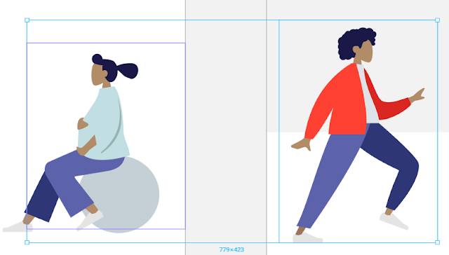
Component on the left (note the purple frame) and a group on the right (not the blue frame).

On the image above the character in the red jacket is a group of separate components and therefore can be rotated and resized as you wish. For example, like this:
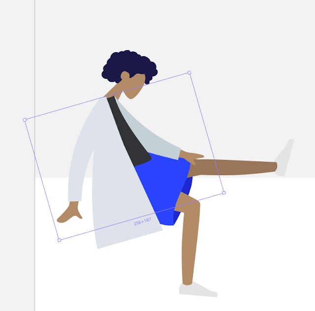
Rotating components

You may, however make more advanced changes, like moving legs and arms separately. For example, maybe we don't like this sad doctor sitting rubbing her knee, we want her to strike a flying hero pose. 

As you remember, I mentioned that anything within components cannot be resized or repositioned. So, since sleeves and hands are element of the "body/jacket" component, you can't resize them unless you break your component into separate objects. The consequence of this action is that you will lose the ability to "switch appearances" by selecting component instances (as the component will cease to exist). So, if you made up your mind about the character's clothing and are ready to move her arms and legs, select the component you want to modify, right-click and choose "detach instance":

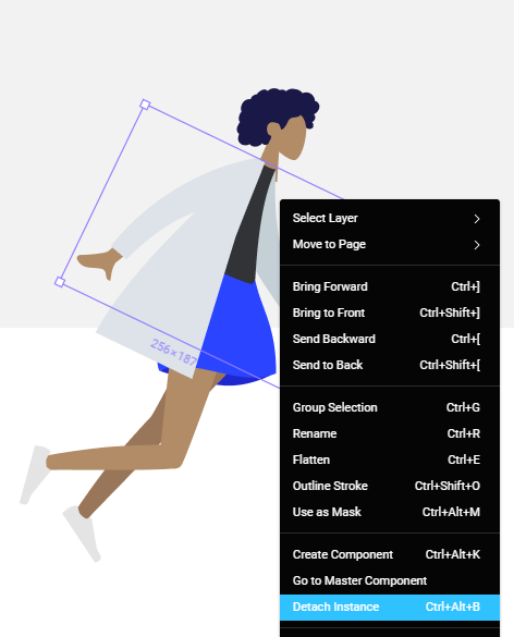
The component will be broken into pieces it's made of.

Note: at the moment Figma doesn't do this procedure well, so once you've clicked "detach instance", you should press Shift-Ctrl-G on the keyboard to get a proper set of separate objects. With this done, feel free to move and rotate them as you wish. You can also group objects (such as arms and hands) with Ctrl+G to rotate them together.

Striking a pose

Exporting

You can export your creations as PNG, SVG or JPG. To do this, select all elements you want on your picture and group them together. Then, in the right-hand panel, find Export menu. There, click +, adjust export settings as you need and click "Export Group". 
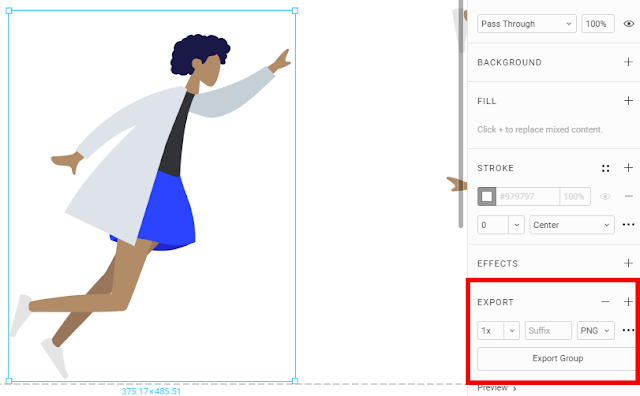
 
Export

Et voila! You can now open Sketch files in Figma and do basic editing. Take that, Apple!


September 7, 2018

Storyline Tutorial: Counting Answers

Sometimes we want to make sure that users attempt an interaction or select the right amount of options. While such mechanics alone are not helpful in ensuring that "people learn", they are great if you want to customise feedback or course content, or if just prevent accidental errors and attention slips.

While Storyline makes it easy to check if the user selected all, one or none of the options, when it comes to n-amount of answers out of many, things get a bit more complicated. In the following example, we'll solve this problem by creating a simple interaction that will count the amount of answers selected and will warn the users if they have selected too few or too many. In this case, the users will have 6 options to choose from and they need to select exactly 3. You can see the finished example here

I've created a Storyline 360 file to get you started (download it here). But if you wish, you can follow this tutorial in your own. Here are the elements you'll need:

  • Objects to choose from (make sure they have the "Selected" state)
  • Submit button (either your own or the one in the player).
  • Layer with feedback for less than 3 answers selected
  • Layer with feedback for more than 3 answers selected


With the set up out of the way, time to add some interactivity. First, create a number variable "AnswersSelected". As the name suggests, it will be used to track the number of answers selected.

Then, select the object "Option 1" (if you're using the tutorial file) or any interactive object (if you're working in your own project) and create the following trigger:


At this point you can add a text box with the variable reference to the slide and preview the slide to check if the trigger is working:

1 is the value of AnswersSelected variable.

If it is working and the variable value is changing with the object state, go ahead and copy this trigger to all other objects. As you paste the trigger, you will notice that all trigger references to "Option 1" automatically change to "Option 2", "Option 3" and so on - depending on which object you are pasting the trigger to. As you can see, copy/pasting triggers can save heaps of time (but only if you make sure the trigger works before copying it).

As you have most likely noticed, at this point the value of the AnswersSelected variable will increase each time an object is selected. So, if you select and de-select the option "Bacon" three times, the course will think that you have selected three answers. So, we need to find a way to track when an answer is de-selected.

These are definitely not the results we are looking for...

Since we add 1 to the variable value whenever an object is selected, we will create trigger that substracts 1 if the same object is de-selected. To achieve that, create the following trigger:


Now, preview the slide once again and verify that the variable value changes correctly when you select and de-select the same object. If it is working (and it should), copy it over to other objects.

With all triggers added, preview the slide once again and check if the variable value changes correctly. At this point it should, but in general, I recommend verifying your work often, so that you can pick up any issues early on and therefore troubleshoot them easier.

Although it is clear that bacon is the only choice that matters!

For the final touches, create a trigger to show feedback for less than 3 answers selected:


Then, copy/paste this trigger and change the name of the layer and the value of the variable to show feedback for more than 3 selected answers.

Finally, create a trigger to allow the user to continue if they selected exactly 3 answers:


And that's all there is to it - preview your work and enjoy!

July 20, 2018

Instructional Design Walkthrough: Addressing Performance Issues with Training

In this post I would like to illustrate my instructional design process, based on one of the training solutions I've designed in the past (although some details have been adjusted to preserve anonymity and confidentiality). The purpose of this walkthrough is to outline, in broad strokes, the instructional design process from the initial request to the final product and highlight the main deliverables of each phase.

As you will notice, my process is based on ADDIE. Although it is very common these days to dismiss ADDIE as "outdated", "non-agile" and "not a framework", I hope that with this post I can show that it's not as bad as it seems and a big part of success can depend on you as an instructional designer, no matter what way of work you're using.

Initial Request

Company A's Quality Department discovered that Customer Service Agents (CSAs) were not correctly handling customer contacts related to issues with the discount codes, which led to monetary losses. Following the discovery, Quality Manager (QM) requested the development of a 2-hour e-learning module to be rolled out to all CSAs globally in 5 different languages, as well as to be incorporated into the new hire curriculum.

Analysis

As the Instructional Designer in charge of this project, I held a discovery meeting with the QM followed with a meeting with a subject matter expert (SME), who had not only the knowledge of the subject itself, but could also provide trustworthy insight into daily work, motivations and challenges of the CSAs.

During this meeting I focused on the answers to the following questions:
  • What is the business goal of this training and how will we measure the success?
  • What does the data tell us about CSAs' performance in each region?
  • What documentation, if any, is already available to the CSAs?
  • What are the typical or recurring mistakes?
  • Why do these mistakes happen?
  • What do we want the CSAs to do instead?
Based on the discovered information, I:
  • Reduced the target audience to the regions where performance issues were confirmed by data
  • Identified real causes of the performance issues, such as lack of practice in the investigation of promotional issues or the fact that performance issues were rooted in the good intentions, but wrong assumptions about the consequences of the actions taken. In other words, CSAs genuinely assumed that they were doing something good. 
  • Formulated the training goal and performance-oriented learning objectives
  • Reduced the projected training time by identifying performance issues that could be addressed through training
The changes to the project scope and learning objectives were signed off by QM and the SME. The reduction of training time and target audience was received particularly positively as it reduced the unnecessary costs of the project.

Design and Development

After completing the analysis, I:
  • Created a course blueprint outlining the identified performance issues with matching instructional activities and, where necessary, sources of theoretical information required to complete these activities.
  • Iteratively designed an e-learning module, beginning with a low-fidelity prototype in the PowerPoint. 
  • Guided SME through the reviews of the prototype and adjusted it based on SMEs feedback.
  • Developed the final module, featuring software simulations and branching conversation scenario in Storyline.
The module featured:
  • Short introductory scenario to introduce the learners to the consequences of their choices
  • Worked examples of the troubleshooting cases
  • Several troubleshooting simulations where the learners were required to use the simulated software environment and available information sources to correctly identify the customer's issue and take appropriate action. Upon completion of each scenario the learners received detailed feedback on their actions.
  • Branching scenario based on the conversation with a customer, where the learner needed to positively present the troubleshooting process and correctly set customer's expectations regarding the outcome of the investigation. 
The finished course was reviewed and tested by the QM, two SMEs who did not participate in the development process, as well as the CSA trainers. It was not possible to test the module on the CSAs themselves due to constraints on their availability.

Implementation and Evaluation

Following the rollout of the training, it was evaluated on the following levels:
  • Reaction of the learners
  • Changes in performance
  • Business impact
As an instructional designer, I designed the reaction evaluation survey and gathered the response data via LMS. I collaborated with the Quality Department on gathering and analysing data for the performance chance and business impact. The change in performance was measured as the decrease in wrong solutions and increase in the reports of the issues via correct channels. The business impact was measured in terms of reduced financial losses related to mishandled promotional issues.

Overall, the training led to statistically significant changes in performance as well as considerably positive business impact. On the level of learner's reaction 90% of respondents stated that the training has provided them with valuable practical knowledge and 96% of respondents stated that they will be applying new skills in their daily work. The comments from the learners highlighted the benefit and importance of simulations and scenarios.

Due to the success of the training and following the consultation with Customer Support trainers and leads, it was included into the standard new hire training to ensure that the performance issues were being not only treated, but also prevented.

February 11, 2018

Pilling a Cat: How Training Actually Works

Whether you are an instructional designer or a customer of external training providers, you may succumb to the idea that success of a training depends on:
  • Length (microlearning!)
  • Format (engaging videos!)
  • Digital delivery (online learning is the best!)
With all the buzz in the media, it's hard to resist this opinion. The idea of micro-videos seems to be more enthralling than pie charts. So here's a simple way to see if the "learning nuggets" and "attention-grabbing videos" produce any return on investment:
  • Watch this short YouTube video about giving a pill to a cat.
  • Get a real cat and try giving it a pill (or a delicious snack they are not in the mood to eat).
Assuming you're new to the task, I'm quite sure that the outcome will depend not on your skills, but on the cooperation of the cat. In other words, it's not your mastery, but the ease of the problem that will define the outcome. As soon as you face a cat that deviates from the example in the video, you will most likely be at a loss (quite possibly a loss of blood, too). So much for the learning nuggets. 

The format of the "nugget" doesn't matter. Whether it  is a video, a drawing, or a drag and drop activity to arrange the steps in the right order. None of these will lead to improved performance post-training. 

The reason is simple. The video contains the basic information: hold the cat's head, aim the pill at the back of its tongue, etc. There is nothing wrong with this information. It is useful and worth knowing before you approach a cat, as it can save you some time and trouble of experimenting. But the information is not enough.

Witnessing a demonstration of an ideal process does not necessarily prompt deep-level processing. In fact, it may lead to the false sense of competency. It's like looking at abstract art and claiming that anyone can do it. On the other hand, engaging with a real cat in the real world, gives you a reality check and stirs up a lot of questions, for example: 
  • How hard can I hold the cat's head without causing damage?
  • Can a cat bite its tongue if I try to close its mouth?
  • If the cat is making noises, which can I ignore and which are the signs that I'm hurting the cat?
  • What to do if the cat mastered tongue-wriggling and pill-spitting quicker than I mastered cat-pilling?
In the ideal situation, after grasping a basic idea of what we're supposed to do, we would venture forth and try to pill different cats with the gradually increasing level of difficulty. We would then reflect on our experience and seek ways to improve the outcome next time. This, and not the format of the presentation, would lead to the true engagement with the subject matter and acquisition of mastery.  

Of course, one may ask - how would it be possible to achieve all of this in an e-learning module? I would say that this is a wrong question to ask, since it focuses on the format. Don't put the format before the goal. Look past isolated events and their formats. Consider performance improvement as a process spanning time and variety of contexts. For example, are the newly trained "cat pillers" assigned to cat pilling or do they do inventory? Do mentors observe their work, encourage reflection and provide feedback? Or do they schedule a perfunctory monthly meeting to listen to the learner's self-report of their mastery? Do the cat pillers have access to supplementary tools to aid their performance? Can they use these tools? 

In short, there is nothing inherently wrong with using videos or providing information. What's wrong is stopping there. Whether we design or buy a training program, it must not stop at the dissemination of information.  To achieve performance improvement, a full-scale training program would need to include:
  • Application of knowledge in novel contexts 
  • Realistic challenge 
  • Gradual increase of difficulty
  • Reflection and feedback
  • Continuation of the development post-training
  • Tools and processes that support performance post-training